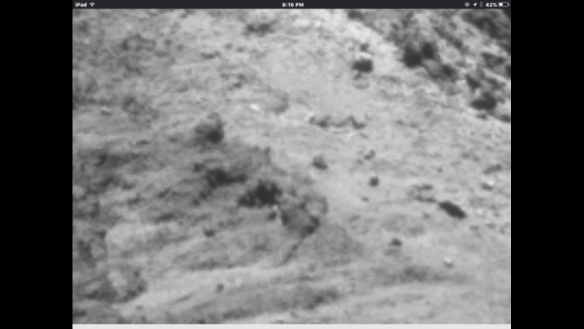
If anyone is still convinced that there is no movement of boulders in Anuket's trio, have a look at the following link:
Moving boulder link
There are several Gif overlays of pre and post perihelion images at the same scale and close to identical angle. enjoy...
Showing posts with label change. Show all posts
Showing posts with label change. Show all posts
Thursday, August 25, 2016


Sunday, August 21, 2016
Andrew Cooper's confirmation of Boulder movements at Anuket
This post has been reblogged for convenience here as a hugely detailed explanation of precisely the changes that I had detected back in May and June 2016 from freely available published images.
This is the post I made when I became 100% convinced of the change:
http://marcoparigi.blogspot.com.au/2016/05/anuket-neck-crack-after-and-before.html
Of course, I realise I hadn't explained it well, and in some ways it seemed obvious, but the following blog post is rich in detail, explanatory notes and close images from varying angles. I challenge anyone to make a counter claim on what is happening on Anuket.
Reblogged from
https://scute1133site.wordpress.com/
BEFORE:

AFTER- the red dot has moved. Old position marked with a smaller dot. Please ignore the red smudges below the green line.


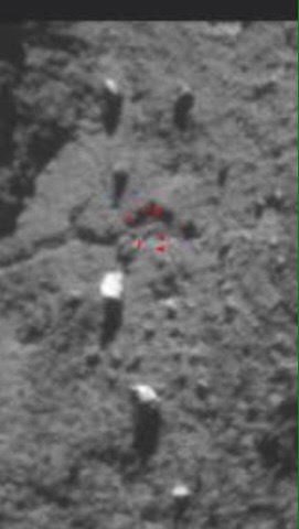
Copyright ESA/Rosetta/NAVCAM – CC BY-SA IGO 3.0
(All photos are from the NAVCAM except one OSIRIS photo which is credited inline. Full credits at bottom).
INTRODUCTION
In June 2016, Marco Parigi published a blog post in which he suggested that a boulder on Anuket appeared to have moved. Here’s the post.
http://marcoparigi.blogspot.co.uk/2016/06/anuket-near-crack-changes.html?m=1
Whilst the apparent movement looked real and compelling, the various photos of the Anuket neck that I’d seen so far didn’t show enough detail for a detailed analysis. They needed to show the boulder actually sitting on one side of a small, local feature in one photo and then sitting on the opposite side of that feature in a later photo. The feature, whatever it might be (a small crack or ridge or discolouration) would then be acting as a reference point or fiduciary point to betray the boulder’s movement.
Recently, I was browsing another of Marco’s posts on a related change close to the boulder in question. I realised that the photos in that post had sufficient detail to look for fiduciary points that the boulder had slid past. Here’s that post, from which the photos further below were culled.
http://marcoparigi.blogspot.co.uk/2016/07/tekhenu-region-overhang-collapse-into.html?m=1
The two photos from the link above are the two main photos used in this post. Others are added further down for extra evidence.
THE PHOTOS
Photos 1 and 2- the triangle of boulders. Originals are included where appropriate but not included in the numbering system.

 .
.


Red- Marco’s boulder that was suggested as having moved. Smudged red is an old artefact. Please ignore.
Light blue- the other two boulders that could be considered to be the base of the triangle. That base stayed the same width but as the triangle appeared to elongate due to the red boulder movement, the base went from looking fairly wide to being comparatively narrow when compared with the height of the triangle.
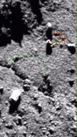
Photos 3 and 4- photo 3 shows the position of the red boulder before the movement. Photo 4 shows it after the movement. These are the header photos, reproduced.

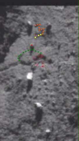


Red- the boulder. Also, in the after photo, the tiny red dot above the actual boulder shows its original location as in the before photo.
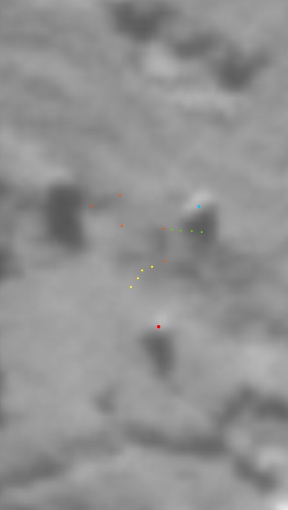
Yellow- a slightly curved feature which leads up to the base of the red boulder before it moves and is marooned above the boulder after it’s moved. This is proof that the red boulder did indeed move.
Orange- a distinctive ‘W’ shape that’s visible in both photos. It’s useful as a a general fiduciary point. It can then be seen that the yellow feature branches off one end of the W in both the before and after photos. You need to look at the unannotated versions to see the W once the dots have shown you where to look for it.
Green- this traces the line of a distinctive quasi-triangular feature, part of which collapsed into the main Anuket crack between the before and after pictures. That collapse was documented by Marco in the second blog post linked above. You can see that in the before picture, the red boulder is some distance from the apex of the green triangle. In the after picture, the red boulder is almost kissing the apex. This, along with the marooned yellow feature proves that the red boulder did move.
Photo 5- this is the same as photo 3 but with a single added tiny red dot. This shows the location to which the red boulder would subsequently move.
USING SHADOW LENGTHS TO PROVE THE MOVEMENT
The lighting in the before photo is similar to that in the after photo. This always makes comparison between features somewhat easier. However, in this case it allows us to check the length of the shadow cast by the red boulder in each case. If we then identify the position of the tip of the shadow for the after shot we can go to the before shot and annotate a shadow from the red boulder in that shot all the way to the known shadow tip in the after shot.
The reasoning here is that if the comet is static and nothing moved, the boulder/shadow geometry for the after shot would be the same as for the lighting-manipulated before shot. It stands to reason that if the after shot lighting angle is faithfully reconstructed in the before shot, the shadow tip of the red boulder absolutely has to reach the same spot in both cases. So our annotated before shot simply assumes the same lighting angle that pertained in the after shot and casts the drawn shadow to the apex that it would definitely reach under the same lighting conditions as the after shot. The result is a ridiculously long shadow, well over twice as long as it should be. So that proves the red boulder moved too. The shadow reconstruction photos follow.
Photos 6 and 7- the red boulder and its shadow (6 is the before shot).
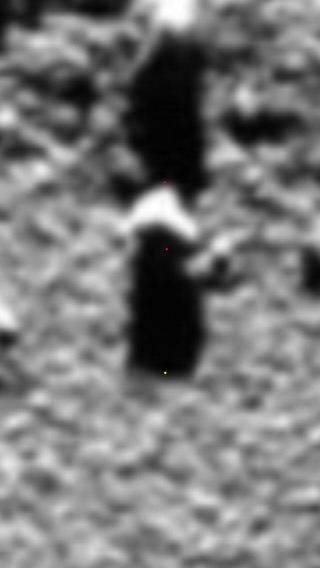

Red- the two sides of the boulder in both cases. The side in shadow is estimated. It may be argued that it would be better to measure the visible width and compare it to the shadow length instead but it just so happens that the distance between the red dots is the same as the width at its widest point and this is the case in both photos. So both methods apply with the boulder/shadow ratios we’re about to calculate.
Yellow- the shadow tip.
The ratio of shadow to boulder is 1.82 for the before shot and 1.58 for the after shot. There’s obviously an error margin involved but they are both certainly well under a ratio of 2.
Photo 8- identifying the tip of the shadow in the after shot (yellow dot).
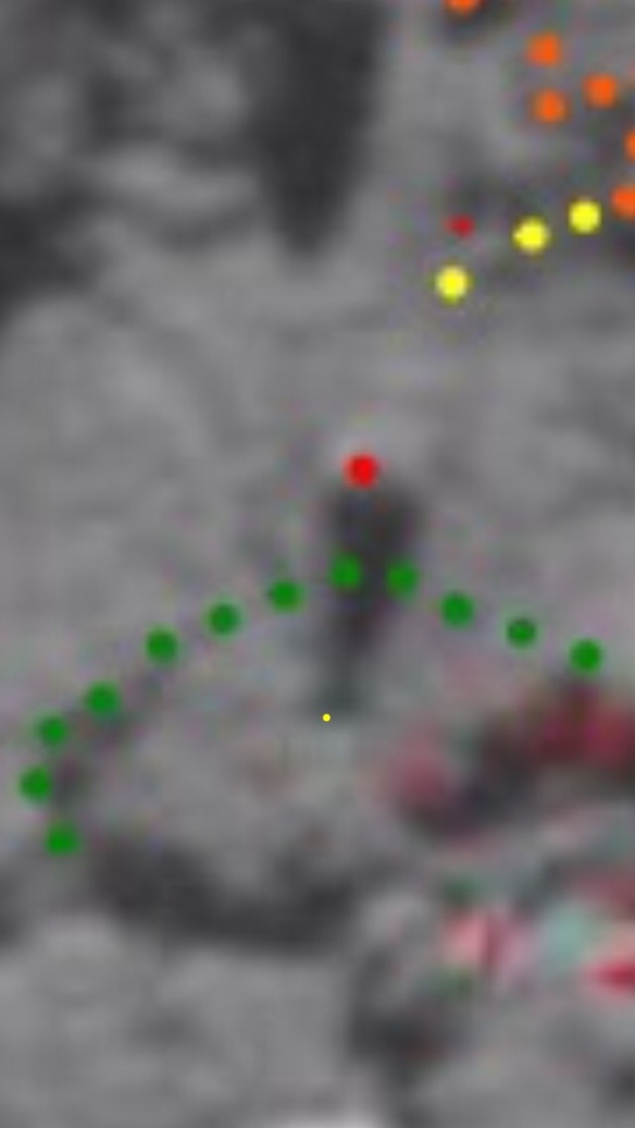
Photo 9- transposing the shadow tip location for the after shot to the before shot (yellow dot).

Photo 10- this is the annotated shadow set-up. The set-up assumes the red boulder never moved and that it’s lit from exactly the same angle as for the after shot. These two assumptions have to result in the shadow reaching the location of the yellow dot. The shadow is annotated accordingly. The ratio of shadow to boulder is 4.16. That’s well over double what it should be, in fact 2.63 times more than the after shot ratio of 1.58. You can see that even the (real) 1.82 ratio shadow in the photo is dwarfed by the ludicrously long annotation.
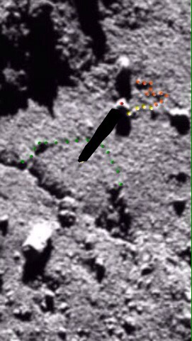
This anomaly is very difficult to explain for a boulder that never moved. The obvious solution for obtaining anything near the required 1.58 ratio is to give the boulder a very noticeable shunt to the left.
THE BLUE ROCK MOVED TOO
This happens quite often when looking in detail at one particular phenomenon. You suddenly realise something else nearby has also torn, slid, delaminated or collapsed. The right hand light blue boulder also slid (or rolled).
Interestingly, it slid up the neck in the opposite direction to the red boulder.
Photos 11 and 12- the blue boulder slide.

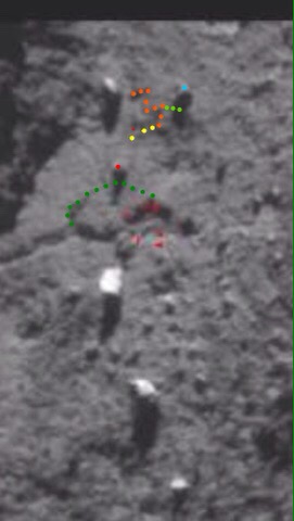


Light blue- the sliding boulder.
Bright green- three dots next to the light blue boulder. These denote an actual line that runs at 90° to the base of the ‘W’. You can see that the blue boulder is below the line in the before shot and above it in the after shot. Please look at the originals to confirm this. The bright green line is obvious and the boulder movement unequivocal but the dots obscure the line itself.
THE AREA HOSTING THE TWO SLIDING BOULDERS IS FLAT


Photos 13 and 14
There has been a suggestion in the comments on the Rosetta blog that the red boulder might be sitting at the top of a slope so that parallax alone accounts for what is actually just apparent movement. At a low-profile angle and looking from below (as in some of these photos) it would then appear to be closer to its light blue twins than it really is. As you rise up the neck to look vertically down at 90° to the surface, the parallax element would not take effect and the full distance between red and blue would be betrayed. The difference in the two cases would amount to apparent movement of the red boulder.
The detailed analysis above proves that the two boulders moved anyway, whether such a slope exists or not but it’s as well to address the issue here so that it’s laid to rest.
The simple solution to establish whether there is indeed such a slope is to look at the area from the side and from low down. If it’s there it will be shown up in full. The two photos below show that no such slope exists. Photo 13 is a before shot and photo 14 is an after shot. The before shot has the boulder triangle annotated because it’s so faint and the nearer blue boulder is as good as whited out. Seeing as these are both essentially side views, flat and with no parallax slopes it’s quite clear that the red boulder has moved. The movement is evidenced in the the spaced-out triangle.
“THE TRIANGLE SEEMS MORE SPACED OUT”
That sub-heading is a quote from Marco’s original post on the boulder, the one that’s linked above. Time and again in the course of working out what the 67P morphology is telling us, we notice something that looks odd but can’t state quite why it looks odd. We might pass over it dozens of times on the way somewhere else, scratching our heads every time, remembering that the paradox is as yet unresolved.
In this case it was the fact that “the triangle seems more spaced out” and yet the degree of movement of the red boulder didn’t seem to warrant it being quite that spaced out. Then, whilst annotating the photos for this post, the paradox was automatically resolved. The triangle is now more spaced out because the top-right boulder moved upwards. That’s why the triangle is now so long and thin.
The two light blue boulders remained essentially the same distance apart while the right hand one moved up. Since they constitute the short base of the triangle, the base remained the same width but shunted back a bit on one side. Combining that with the red boulder extending the long tip explains the spaced out triangle.
And, more importantly, we now have two boulders that have moved and they’ve moved in opposite directions: straight up and straight down the neck.
TWO MORE BEFORE/AFTER PHOTOS TO COMPARE
Since you should now be more familiar with the fiduciary points, these two photos are, for the most part, left unannotated. However the two closest zoom components each have an annotated version. The annotations are the same colours as for the header (reproduced with their key in photos 3 and 4). There are eight photos, four versions of each as follows: original, medium zoom, close zoom, close zoom annotated. They’re presented in pairs for comparison of course.
Photos 15-22
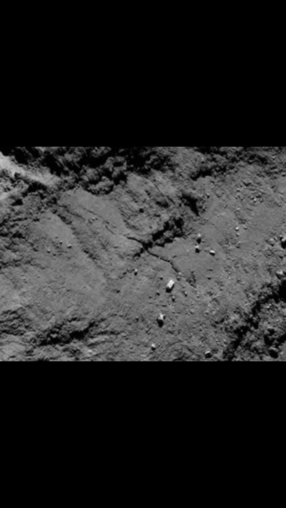
Credit ESA/Rosetta/MPS for OSIRIS Team MPS/UPD/LAM/IAA/SSO/INTA/UPM/DyASP/IDA/

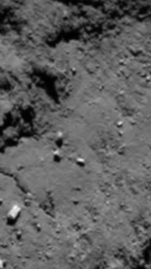


Credits: ESA/Rosetta/MPS for OSIRIS Team MPS/UPD/LAM/IAA/SSO/INTA/UPM/DyASP/IDA/A.COOPER
REASON FOR THE BOULDER MOVEMENT
The reason for the movement of the two boulders and the fact they have moved in opposite directions will probably get its own post when other evidence avails itself, as it usually does. However, as a prelude to such an analysis, one possible reason for the red boulder moving down the neck is the subsidence of material into the neck crack only a short distance away. That’s described in the second link above and it’s placed here as well for convenience:
http://marcoparigi.blogspot.co.uk/2016/07/tekhenu-region-overhang-collapse-into.html?m=1
It would be odd if the two events, collapse and boulder movement, were unrelated when in such close proximity and while such little change has been noticed elsewhere on the comet (notwithstanding Marco’s other Anuket neck change discoveries and the Imhotep slump). It could be argued that the collapse into the crack, being only 100 metres or so away, caused a slight trough between that apex of the subsided material and the boulder, enough for it to affect the gravity gradient and allow the boulder to slide or roll in that direction.
Slumping in any situation is prone to cause sympathetic ground movement around the slump. Indeed there is some indication in the photos of a slight trough in the after photos but it’s to the right of the slide track and could be the lighting anyway. We await the OSIRIS after photos.
As for the blue rock moving up the neck, there are delaminations in that direction as a result of stretch. The boulder triangle is sitting right next to the ‘orange tell-tale line’, after all. That line is itself a one-kilometre-long delamination from head rim to body (Part 25 of this blog).
STRETCH THEORY AS A PREDICTIVE TOOL
Another reason for citing delaminations is this. That orange ‘W’ in the pictures above was just a random feature in my mind until I realised that there was a boulder placed neatly at each end and one in the middle. One boulder for each apex. We already know from experience that delaminations often leave boulders behind as they shunt away from a particular position. They tend to shed talus from obviously ragged cliffs (see Part 50) and chunky boulders from squared-off cliffs (e.g. the Hapi boulders and the three Aker boulders).
The W is very blocky or you might say, squared off, and there are chunky boulders right next to it as if related to it. The knowledge of blocky cliffs shedding large boulders, derived only from stretch theory, prompted me to hunt for another W without even knowing whether one existed at all.
Stretch theory also told me where to look: one or two hundred metres up the neck, possibly with a circa 45° southerly bias. The upward component is due to the obvious neck stretch vector (Part 25). The southerly bias is because everything was delaminating along the shear line and around the soon-to-be head rim just before head shear. Those delaminations have been identified (not blogged yet but tweeted). The combination of southerly delamination before head shear and easterly (up the neck) delamination during neck stretch results in a circa 45° vector-summed resultant direction. So that’s where I looked first. And sure enough, there it was:

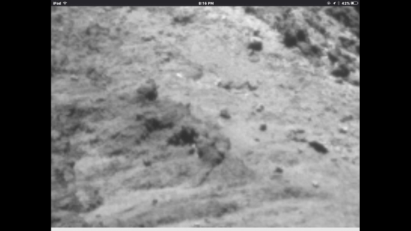
Photo 23
That’s the predictive power of stretch theory and it’s why the boulders got left behind in that ‘W matches the boulder triad’ configuration.
Photo 24- the same as photo 23 but with the boulder dots depicting the triangle in the ‘before’ configuration.
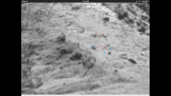
This shows how closely related they are to the W. Notice how the right hand end of the newly found W turns 90° to form a chunky rectangle just like its classic twin (whose rectangle is more visible in the header).
CONCLUSION
This part puts to rest any doubts that Marco Parigi’s boulders moved. His discovery in the first link above is therefore the first documented account of moving boulders on 67P/Churyumov-Gerasimenko.
PHOTO CREDITS
FOR NAVCAM
Copyright ESA/Rosetta/NAVCAM – CC BY-SA IGO 3.0
To view a copy of this licence please visit:
http://creativecommons.org/licenses/by-sa/3.0/igo/
FOR OSIRIS
Credits: ESA/Rosetta/MPS for OSIRIS Team MPS/UPD/LAM/IAA/SSO/INTA/UPM/DyASP/IDA/
All dotted annotations by Andrew Cooper
This is the post I made when I became 100% convinced of the change:
http://marcoparigi.blogspot.com.au/2016/05/anuket-neck-crack-after-and-before.html
Of course, I realise I hadn't explained it well, and in some ways it seemed obvious, but the following blog post is rich in detail, explanatory notes and close images from varying angles. I challenge anyone to make a counter claim on what is happening on Anuket.
Reblogged from
https://scute1133site.wordpress.com/
BEFORE:

AFTER- the red dot has moved. Old position marked with a smaller dot. Please ignore the red smudges below the green line.


Copyright ESA/Rosetta/NAVCAM – CC BY-SA IGO 3.0
(All photos are from the NAVCAM except one OSIRIS photo which is credited inline. Full credits at bottom).
INTRODUCTION
In June 2016, Marco Parigi published a blog post in which he suggested that a boulder on Anuket appeared to have moved. Here’s the post.
http://marcoparigi.blogspot.co.uk/2016/06/anuket-near-crack-changes.html?m=1
Whilst the apparent movement looked real and compelling, the various photos of the Anuket neck that I’d seen so far didn’t show enough detail for a detailed analysis. They needed to show the boulder actually sitting on one side of a small, local feature in one photo and then sitting on the opposite side of that feature in a later photo. The feature, whatever it might be (a small crack or ridge or discolouration) would then be acting as a reference point or fiduciary point to betray the boulder’s movement.
Recently, I was browsing another of Marco’s posts on a related change close to the boulder in question. I realised that the photos in that post had sufficient detail to look for fiduciary points that the boulder had slid past. Here’s that post, from which the photos further below were culled.
http://marcoparigi.blogspot.co.uk/2016/07/tekhenu-region-overhang-collapse-into.html?m=1
The two photos from the link above are the two main photos used in this post. Others are added further down for extra evidence.
THE PHOTOS
Photos 1 and 2- the triangle of boulders. Originals are included where appropriate but not included in the numbering system.

 .
.

Red- Marco’s boulder that was suggested as having moved. Smudged red is an old artefact. Please ignore.
Light blue- the other two boulders that could be considered to be the base of the triangle. That base stayed the same width but as the triangle appeared to elongate due to the red boulder movement, the base went from looking fairly wide to being comparatively narrow when compared with the height of the triangle.
Photos 3 and 4- photo 3 shows the position of the red boulder before the movement. Photo 4 shows it after the movement. These are the header photos, reproduced.


Red- the boulder. Also, in the after photo, the tiny red dot above the actual boulder shows its original location as in the before photo.
Yellow- a slightly curved feature which leads up to the base of the red boulder before it moves and is marooned above the boulder after it’s moved. This is proof that the red boulder did indeed move.
Orange- a distinctive ‘W’ shape that’s visible in both photos. It’s useful as a a general fiduciary point. It can then be seen that the yellow feature branches off one end of the W in both the before and after photos. You need to look at the unannotated versions to see the W once the dots have shown you where to look for it.
Green- this traces the line of a distinctive quasi-triangular feature, part of which collapsed into the main Anuket crack between the before and after pictures. That collapse was documented by Marco in the second blog post linked above. You can see that in the before picture, the red boulder is some distance from the apex of the green triangle. In the after picture, the red boulder is almost kissing the apex. This, along with the marooned yellow feature proves that the red boulder did move.
Photo 5- this is the same as photo 3 but with a single added tiny red dot. This shows the location to which the red boulder would subsequently move.

USING SHADOW LENGTHS TO PROVE THE MOVEMENT
The lighting in the before photo is similar to that in the after photo. This always makes comparison between features somewhat easier. However, in this case it allows us to check the length of the shadow cast by the red boulder in each case. If we then identify the position of the tip of the shadow for the after shot we can go to the before shot and annotate a shadow from the red boulder in that shot all the way to the known shadow tip in the after shot.
The reasoning here is that if the comet is static and nothing moved, the boulder/shadow geometry for the after shot would be the same as for the lighting-manipulated before shot. It stands to reason that if the after shot lighting angle is faithfully reconstructed in the before shot, the shadow tip of the red boulder absolutely has to reach the same spot in both cases. So our annotated before shot simply assumes the same lighting angle that pertained in the after shot and casts the drawn shadow to the apex that it would definitely reach under the same lighting conditions as the after shot. The result is a ridiculously long shadow, well over twice as long as it should be. So that proves the red boulder moved too. The shadow reconstruction photos follow.
Photos 6 and 7- the red boulder and its shadow (6 is the before shot).


Red- the two sides of the boulder in both cases. The side in shadow is estimated. It may be argued that it would be better to measure the visible width and compare it to the shadow length instead but it just so happens that the distance between the red dots is the same as the width at its widest point and this is the case in both photos. So both methods apply with the boulder/shadow ratios we’re about to calculate.
Yellow- the shadow tip.
The ratio of shadow to boulder is 1.82 for the before shot and 1.58 for the after shot. There’s obviously an error margin involved but they are both certainly well under a ratio of 2.
Photo 8- identifying the tip of the shadow in the after shot (yellow dot).

Photo 9- transposing the shadow tip location for the after shot to the before shot (yellow dot).

Photo 10- this is the annotated shadow set-up. The set-up assumes the red boulder never moved and that it’s lit from exactly the same angle as for the after shot. These two assumptions have to result in the shadow reaching the location of the yellow dot. The shadow is annotated accordingly. The ratio of shadow to boulder is 4.16. That’s well over double what it should be, in fact 2.63 times more than the after shot ratio of 1.58. You can see that even the (real) 1.82 ratio shadow in the photo is dwarfed by the ludicrously long annotation.

This anomaly is very difficult to explain for a boulder that never moved. The obvious solution for obtaining anything near the required 1.58 ratio is to give the boulder a very noticeable shunt to the left.
THE BLUE ROCK MOVED TOO
This happens quite often when looking in detail at one particular phenomenon. You suddenly realise something else nearby has also torn, slid, delaminated or collapsed. The right hand light blue boulder also slid (or rolled).
Interestingly, it slid up the neck in the opposite direction to the red boulder.
Photos 11 and 12- the blue boulder slide.


Light blue- the sliding boulder.
Bright green- three dots next to the light blue boulder. These denote an actual line that runs at 90° to the base of the ‘W’. You can see that the blue boulder is below the line in the before shot and above it in the after shot. Please look at the originals to confirm this. The bright green line is obvious and the boulder movement unequivocal but the dots obscure the line itself.
THE AREA HOSTING THE TWO SLIDING BOULDERS IS FLAT


Photos 13 and 14
There has been a suggestion in the comments on the Rosetta blog that the red boulder might be sitting at the top of a slope so that parallax alone accounts for what is actually just apparent movement. At a low-profile angle and looking from below (as in some of these photos) it would then appear to be closer to its light blue twins than it really is. As you rise up the neck to look vertically down at 90° to the surface, the parallax element would not take effect and the full distance between red and blue would be betrayed. The difference in the two cases would amount to apparent movement of the red boulder.
The detailed analysis above proves that the two boulders moved anyway, whether such a slope exists or not but it’s as well to address the issue here so that it’s laid to rest.
The simple solution to establish whether there is indeed such a slope is to look at the area from the side and from low down. If it’s there it will be shown up in full. The two photos below show that no such slope exists. Photo 13 is a before shot and photo 14 is an after shot. The before shot has the boulder triangle annotated because it’s so faint and the nearer blue boulder is as good as whited out. Seeing as these are both essentially side views, flat and with no parallax slopes it’s quite clear that the red boulder has moved. The movement is evidenced in the the spaced-out triangle.
“THE TRIANGLE SEEMS MORE SPACED OUT”
That sub-heading is a quote from Marco’s original post on the boulder, the one that’s linked above. Time and again in the course of working out what the 67P morphology is telling us, we notice something that looks odd but can’t state quite why it looks odd. We might pass over it dozens of times on the way somewhere else, scratching our heads every time, remembering that the paradox is as yet unresolved.
In this case it was the fact that “the triangle seems more spaced out” and yet the degree of movement of the red boulder didn’t seem to warrant it being quite that spaced out. Then, whilst annotating the photos for this post, the paradox was automatically resolved. The triangle is now more spaced out because the top-right boulder moved upwards. That’s why the triangle is now so long and thin.
The two light blue boulders remained essentially the same distance apart while the right hand one moved up. Since they constitute the short base of the triangle, the base remained the same width but shunted back a bit on one side. Combining that with the red boulder extending the long tip explains the spaced out triangle.
And, more importantly, we now have two boulders that have moved and they’ve moved in opposite directions: straight up and straight down the neck.
TWO MORE BEFORE/AFTER PHOTOS TO COMPARE
Since you should now be more familiar with the fiduciary points, these two photos are, for the most part, left unannotated. However the two closest zoom components each have an annotated version. The annotations are the same colours as for the header (reproduced with their key in photos 3 and 4). There are eight photos, four versions of each as follows: original, medium zoom, close zoom, close zoom annotated. They’re presented in pairs for comparison of course.
Photos 15-22

Credit ESA/Rosetta/MPS for OSIRIS Team MPS/UPD/LAM/IAA/SSO/INTA/UPM/DyASP/IDA/


Credits: ESA/Rosetta/MPS for OSIRIS Team MPS/UPD/LAM/IAA/SSO/INTA/UPM/DyASP/IDA/A.COOPER

REASON FOR THE BOULDER MOVEMENT
The reason for the movement of the two boulders and the fact they have moved in opposite directions will probably get its own post when other evidence avails itself, as it usually does. However, as a prelude to such an analysis, one possible reason for the red boulder moving down the neck is the subsidence of material into the neck crack only a short distance away. That’s described in the second link above and it’s placed here as well for convenience:
http://marcoparigi.blogspot.co.uk/2016/07/tekhenu-region-overhang-collapse-into.html?m=1
It would be odd if the two events, collapse and boulder movement, were unrelated when in such close proximity and while such little change has been noticed elsewhere on the comet (notwithstanding Marco’s other Anuket neck change discoveries and the Imhotep slump). It could be argued that the collapse into the crack, being only 100 metres or so away, caused a slight trough between that apex of the subsided material and the boulder, enough for it to affect the gravity gradient and allow the boulder to slide or roll in that direction.
Slumping in any situation is prone to cause sympathetic ground movement around the slump. Indeed there is some indication in the photos of a slight trough in the after photos but it’s to the right of the slide track and could be the lighting anyway. We await the OSIRIS after photos.
As for the blue rock moving up the neck, there are delaminations in that direction as a result of stretch. The boulder triangle is sitting right next to the ‘orange tell-tale line’, after all. That line is itself a one-kilometre-long delamination from head rim to body (Part 25 of this blog).
STRETCH THEORY AS A PREDICTIVE TOOL
Another reason for citing delaminations is this. That orange ‘W’ in the pictures above was just a random feature in my mind until I realised that there was a boulder placed neatly at each end and one in the middle. One boulder for each apex. We already know from experience that delaminations often leave boulders behind as they shunt away from a particular position. They tend to shed talus from obviously ragged cliffs (see Part 50) and chunky boulders from squared-off cliffs (e.g. the Hapi boulders and the three Aker boulders).
The W is very blocky or you might say, squared off, and there are chunky boulders right next to it as if related to it. The knowledge of blocky cliffs shedding large boulders, derived only from stretch theory, prompted me to hunt for another W without even knowing whether one existed at all.
Stretch theory also told me where to look: one or two hundred metres up the neck, possibly with a circa 45° southerly bias. The upward component is due to the obvious neck stretch vector (Part 25). The southerly bias is because everything was delaminating along the shear line and around the soon-to-be head rim just before head shear. Those delaminations have been identified (not blogged yet but tweeted). The combination of southerly delamination before head shear and easterly (up the neck) delamination during neck stretch results in a circa 45° vector-summed resultant direction. So that’s where I looked first. And sure enough, there it was:


Photo 23
That’s the predictive power of stretch theory and it’s why the boulders got left behind in that ‘W matches the boulder triad’ configuration.
Photo 24- the same as photo 23 but with the boulder dots depicting the triangle in the ‘before’ configuration.


This shows how closely related they are to the W. Notice how the right hand end of the newly found W turns 90° to form a chunky rectangle just like its classic twin (whose rectangle is more visible in the header).
CONCLUSION
This part puts to rest any doubts that Marco Parigi’s boulders moved. His discovery in the first link above is therefore the first documented account of moving boulders on 67P/Churyumov-Gerasimenko.
PHOTO CREDITS
FOR NAVCAM
Copyright ESA/Rosetta/NAVCAM – CC BY-SA IGO 3.0
To view a copy of this licence please visit:
http://creativecommons.org/licenses/by-sa/3.0/igo/
FOR OSIRIS
Credits: ESA/Rosetta/MPS for OSIRIS Team MPS/UPD/LAM/IAA/SSO/INTA/UPM/DyASP/IDA/
All dotted annotations by Andrew Cooper
Thursday, July 17, 2008
A new "Ten Year Plan"
Back in 1992 I was playing a round of golf with "The Groose" and Andrewww. I asked them where they wanted to be in ten years time. I can't remember what they said, but I knew that I wanted to be back in Townsville with a stable life with plenty of family support and perhaps an interest in the family business. When me & K decided to have kids, we had a secret pact to space our children about three years apart and to have a maximum of two boys. Once Z was born, our ten year plan was complete, and ever since, I have been struggling to have a vision of where I want to be in ten years time. The truth is, any ambitions I had as an individual are no longer relevant eg. - to become a great tennis/trumpet player. Ambitions I had vicariously for my children have come up against the barrier of their own free will being at odds with what I believe they *should* wish to strive for. I seem to have lost the steering wheel to my life and I'm just relying on accelerator, break, gears and momentum for any control at all. Any ideas?
Friday, June 08, 2007
Privatisation/Nationalisation Axioms
* - Continuous Spectrum. For any "Stuff" there is a continuum of policy of ownership from Government-owned monopoly all the way to unregulated competitive private ownership. Some markers being Highly regulated private monopoly, Government owned but some private subcontracting, majority owned near-monopoly competing with private enterprises, Government services competing in a fairly level field with private. Conveniently economists can come to a consensensus on where on the spectrum a policy puts itself.
* - Independent nation-states able to individually pursue and experiment with policies without being able to impose such policy on other countries or be imposed on from the UN or other supranational entity.
* - The judgement on policy is essentially which country does well in a typical competitive environment in the ideal where the policy concerned is the only point of difference.
* - There is little or no interdependence between different "stuff" being privatised. ie. if A is privatised, and B is privatised, the net effect will be approximately the sum of the effects of each.
* - Price controls on "Stuff" which is nominally privatised has the effect of removing a large chunk of control from private interests and should be considered in the nationalisation end of the spectrum.
* - Independent nation-states able to individually pursue and experiment with policies without being able to impose such policy on other countries or be imposed on from the UN or other supranational entity.
* - The judgement on policy is essentially which country does well in a typical competitive environment in the ideal where the policy concerned is the only point of difference.
* - There is little or no interdependence between different "stuff" being privatised. ie. if A is privatised, and B is privatised, the net effect will be approximately the sum of the effects of each.
* - Price controls on "Stuff" which is nominally privatised has the effect of removing a large chunk of control from private interests and should be considered in the nationalisation end of the spectrum.
Saturday, April 21, 2007
Vote Labor???
We need a higher unemployment rate. It's not just that I like Kevin Rudd somewhat, and that the economic action is concentrated in water trading (and carbon trading). I am being selfish in this instance because a higher unemployment rate is good for small business owners. Ok, so it's not so good for the country as a whole, nor for the newly unemployed, but quite frankly, that's their problem. Kevin Rudd's IR policies are not laid down in stone, but the noises are in the direction of winding back selected workchoice legislation. What would be typical in Australian election campaigns is that the wind back is "minimalised" by the policy wonks. This is a strategy to maximise votes. Why advertise a complete windback when any windback more than the Liberals are promising will achieve the vote of the interested individual.
The "Labour supply shortfall" is an illusion based on the "lump of labour" fallacy. Low unemployment rates have the tendency to give that illusion. The difficulty in finding employees is real, and scaring (all the other) employers away from hiring is the only realistic avenue to making it easier. The unfair dismissal legislation is the obvious choice for a minimalist windback. This will scare the bejeepers out of most small businesses from employing (or even to dismissing while it is still legal) while my own analysis shows these fears to be somewhat overplayed or irrational. This is why on balance it would play in my individual favour.
The "Labour supply shortfall" is an illusion based on the "lump of labour" fallacy. Low unemployment rates have the tendency to give that illusion. The difficulty in finding employees is real, and scaring (all the other) employers away from hiring is the only realistic avenue to making it easier. The unfair dismissal legislation is the obvious choice for a minimalist windback. This will scare the bejeepers out of most small businesses from employing (or even to dismissing while it is still legal) while my own analysis shows these fears to be somewhat overplayed or irrational. This is why on balance it would play in my individual favour.
Monday, February 12, 2007
Dissecting articles from Realclimate.org
WSJ Editorial Board: Head Still Buried in the Sand
Filed under: Climate Science RC Forum— group @ 8:38 am
While the rest of the world has basically accepted the conclusion of the latest IPCC report, one small village still holds out against the tide - the Wall Street Journal editorial board. This contrasts sharply with the news section of the paper which is actually pretty good. They had a front-page piece on business responses to global warming issues which not only pointed out that business was taking an interest in carbon reduction, but the article more or less took as a given that the problem was real. However, as we have pointed out before, the editorial pages operate in a universe all their own.
I will start with their latest headline piece - It is very typical anyhow. As far as the title goes, using a metaphor is a form of "proof by ridicule". What exactly they are trying to prove is not obvious to start with, but the means they are using is attacking an opinion piece. To falsify a scientific statement you must use science, to falsify an opinion you must use ridicule. Fairly obvious, but they are not really showing their hand.
The first sentence uses the terms "village" and "Tide". I am not sure if this is subliminally pushing the "sea is rising" fear triggers, but is the tide public opinion? Public opinion of what? The tide is of pro-environmentalism and the village is of dissenting opinions published in news & magazines. Almost all magazines (including "the Economist") have stopped publishing dissenting views (whether they be scientists or whatever). I am not really sure why that is, but for instance, the Economist has not recently written anything at all from Bjorn Lomborg, while a couple of years ago, they backed him up in almost everything he said.
The third sentence mentions business responses and interest, and the taking as a given that the PROBLEM is REAL (by the front page article). The science demonstrates beyond reasonable doubt that there is global warming and that humans are the predominant factor. That it is a "problem" is a much less scientifically tested assertion. Proving that there is global warming and that it is caused by humans does not prove that there is a problem in itself. Also, there is the assertion that it is the most significant environmental problem. This assumes a prioritised list, but prioritised lists have been rejected as presumptious.
The fourth sentence is again criticising the opinion piece, and again ridiculing it. I have found this type of tactic in operation with groups of evangelical christians. It was exceedingly effective when used in groups of majority christians and a minority of uncommitted youths. They would ridicule (say) evolution, and attack the inconsistencies of darwinism and any proven errors any Darwinist has ever made. It is difficult for an uncommitted person to resist this kind of peer pressure. I think this is what is happening in Realclimate. There are a majority of readers which are "converted" and a minority of uncommitted and recalcitrant, which is a perfect environment for winning over the uncommitted.
Filed under: Climate Science RC Forum— group @ 8:38 am
While the rest of the world has basically accepted the conclusion of the latest IPCC report, one small village still holds out against the tide - the Wall Street Journal editorial board. This contrasts sharply with the news section of the paper which is actually pretty good. They had a front-page piece on business responses to global warming issues which not only pointed out that business was taking an interest in carbon reduction, but the article more or less took as a given that the problem was real. However, as we have pointed out before, the editorial pages operate in a universe all their own.
I will start with their latest headline piece - It is very typical anyhow. As far as the title goes, using a metaphor is a form of "proof by ridicule". What exactly they are trying to prove is not obvious to start with, but the means they are using is attacking an opinion piece. To falsify a scientific statement you must use science, to falsify an opinion you must use ridicule. Fairly obvious, but they are not really showing their hand.
The first sentence uses the terms "village" and "Tide". I am not sure if this is subliminally pushing the "sea is rising" fear triggers, but is the tide public opinion? Public opinion of what? The tide is of pro-environmentalism and the village is of dissenting opinions published in news & magazines. Almost all magazines (including "the Economist") have stopped publishing dissenting views (whether they be scientists or whatever). I am not really sure why that is, but for instance, the Economist has not recently written anything at all from Bjorn Lomborg, while a couple of years ago, they backed him up in almost everything he said.
The third sentence mentions business responses and interest, and the taking as a given that the PROBLEM is REAL (by the front page article). The science demonstrates beyond reasonable doubt that there is global warming and that humans are the predominant factor. That it is a "problem" is a much less scientifically tested assertion. Proving that there is global warming and that it is caused by humans does not prove that there is a problem in itself. Also, there is the assertion that it is the most significant environmental problem. This assumes a prioritised list, but prioritised lists have been rejected as presumptious.
The fourth sentence is again criticising the opinion piece, and again ridiculing it. I have found this type of tactic in operation with groups of evangelical christians. It was exceedingly effective when used in groups of majority christians and a minority of uncommitted youths. They would ridicule (say) evolution, and attack the inconsistencies of darwinism and any proven errors any Darwinist has ever made. It is difficult for an uncommitted person to resist this kind of peer pressure. I think this is what is happening in Realclimate. There are a majority of readers which are "converted" and a minority of uncommitted and recalcitrant, which is a perfect environment for winning over the uncommitted.
Subscribe to:
Posts (Atom)